I love email marketing and for good reason - it’s effective and it delivers. You can achieve an average return on investment of $38 for ever dollar you spend, making email a lucrative channel. Although, if your campaigns aren’t paying off, it’s time to take a look at your email’s readability.
A handy way I like to think of emails is as bar PR’s in Ibiza Town. They want to convince you to drink in their bar, which is just one of many to choose from. How they speak to you, how the bar looks, and the offer they give you is usually the dealbreaker.
With email the dealbreaker is how clear and compelling your content is in three core places:
- Your subject line
- The content of your email
- Throughout your landing page
The level to which you are able to grab attention through those stages determines how well your campaign performs.
It decides how much new revenue you bring into your business.
And, importantly, it dictates how great you look as a marketer to your boss and colleagues. Always something I like to keep in mind… :)

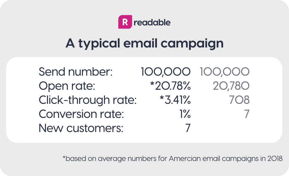
If you start off with a very decent send number of 100,000 emails, you are likely to only see 20.78% actually to open your email. This leaves you with 20,780, nowhere near as big a number as you started, but it’s still decent.
Now, you may think getting people to open your email is the hard part, but it’s not. Convincing them to click on a call to action is.
The average click-through rate in America in 2018 was 3.41%. In our wee scenario, that amounts to only 708 people heading to your website.
This is still a good number of focussed potential customers landing on your site, but deep down you know you can do better. Especially when your conversion rate to sale/subscription of those 947 is, at best, 1%.
Seven new customers from 100,000 doesn’t feel high enough, and it’s not.
To fully talk through all the methods that will help you increase your results needs more than a blog to give it justice. So, today I’m concentrating on readability.
What is readability?
Readability is all about delivering your message in as clear a way as possible. This is the cornerstone of marketing, no matter the channel.
It’s about focussing your message on the core elements that will drive your narrative. With email, every word has to justify its place and be used for maximum impact.
Emails with high readability have these features in common:
- Concise - it gets to the point
- It doesn’t have overly long sentences, long words, jargon, cliches, techspeak or geekspeak
- Active voice is used to inspire and motive, rather than passive voice
In short, if your email is highly readable it’s also engaging, easy to grasp, and fun to read. Low readability emails tend to be on the wrong side of boring, busy, and difficult to understand.
They are also more likely to end up in trash folders, be unsubscribed from and marked as spam. All before your reader event gets past the first few lines.
That’s a hell of a waste of your time and resources. It’s also a lost opportunity, that you’ll never get back.
Let’s do our best to avoid that situation. Let’s make sure we boost your email’s performance by providing readable content. Content that customers are more likely to open, read, and click through.
How do you solve a problem like busy inboxes?
It’s too simplistic to say readability will solve all of your inbox woes. But, it is entirely correct to say clear subject lines go a long way to boosting your open rate.
Let's look at an example of my favorite made-up portable speakers, BoomMaster.
An email to the BoomMaster marketing database is about to be scheduled. Their marketing team has two subject lines to choose from:
- 86 dB of sound, 10 Hour battery life. Buy now, only $99.
- ? Super portable with awesome sound. Buy now, only $99.
It’s important to note their target audience, while not being audiophiles, are still looking to buy a good quality speaker.
Both options will generate opens, but it’s the second one, which provides a more human touch, that will perform better.
The first option is too matter of fact and needs the reader to already know “86 dB of sound” refers to how powerful the speaker is. This is important information, but save it for the landing page and, even then, for this product it doesn’t need to be front and center.
The second shows the reader immediately what’s in it for them - the opportunity to buy a fun speaker with great sound.
When it comes to your email content, keep it simple
Your email has one job and one job only, to send people to your website. To do this, you need clearly written content that compels the reader to click your links and call to actions.
In my freelancer days, I dealt with a client who couldn’t understand why their email sends had amazing open rates. They averaged around 60 to 70% from their well-cultivated database, but almost zero click-throughs.
The fix was a simple one.
They were pasting each of their blogs into their emails in full and their readers had no need to visit their website... As such, the number of new customers generated from their site was also zero.
I redesigned the emails for them to show only part of the blog, alongside a read more call to action. Straightaway this brought an upturn in traffic, which could now be pushed through their funnel.
The moral of the story here is to keep things simple. And this is applicable to sales emails too, perhaps more so.
Let the landing page on your website do the heavy lifting. Your email is simply there to get people through the door. Just like our good friends, the Ibiza Town bar PRs.
It’s a landing page, not a technical document
Let me clarify, by letting the landing pages do the heavy lifting I’m not saying it’s time to write the equivalent of War and Peace.
Landing pages need to be focused on the sale, sign-up, download, or whatever your end goal is.
However, customers often like to dig into the detail and should be pushed towards a product page or a call with your sales team. Preferably both.
Simplicity with focus on a clear message is the end goal with your landing page.
All of that is fine to say, but how do I measure my content’s readability?
Good news, you can score your content with readability formulas that have been trusted for decades.
Even better news, we’ve pulled them all together into one fabulous and easy to use app called ReadablePro. Give ReadablePro a try today for free and start making an impact on your email content.
The Flesch-Kincaid Grade Level is the most respected and well-known readability formula. It’s commonly used by government agencies, like the Department of Defense, ensuring government materials are easy to read and understand. The UK government also backs the use of ReadablePro.
Other popular and effective readability formulas include Flesch Reading Ease, SMOG Index, and Gunning Fog. Each takes a slightly different approach to measuring readability.
But, don’t fret we’ve taken away the hard work for you with ReadablePro.
Score your full campaign for readability by sending a test message to your Readable account, then use the URL tool to score your landing page.
You’ll receive a readability grade, a breakdown by readability formula and we’ll highlight the areas you need to improve.
Some bonus tips on improving readability
Here are a few readability best practices to keep in mind:
- Use shorter sentences. Aim for under 30 characters.
- Use shorter, easier to understand words. Saying “burdensome” or “herculean” when you could simply say “difficult” or “hard” can be off-putting for readers.
- Read your email out loud to make sure it’s clear and makes sense. Don’t focus so much on readability that you end up with a choppy email that’s missing words or transitions. Robotic voices are not what we are looking for.

- Switch from passive voice to active voice – read this for more some more handy tips: Mistakes were made: understanding passive voice
- It’s 100% worth saying again, don’t neglect your subject line. Remember, less than 21% of emails are actually opened. A highly readable, snappy subject line is an email marketer’s best friend.
One of the best things about measuring readability is that it changes how you write. After correcting a few emails, you will soon find yourself writing in a more concise and readable way.
Remember that your customers and prospects are busy people. They will most likely skim your email and only read around 20-28% of the actual words.
Be clear, be concise, be Readable.
sources: marketingsherpa.com, constantcontact.com, nytimes.com, expandedramblings.com, nngroup.com


