You might have noticed it's been a little while since our last "what's new" update, and there's a good reason for that - we've been working on some large-scale changes behind the scenes, and those take time!
On Monday we rolled out the first of those - a design overhaul of our app. Here's what we've changed:
Colour scheme
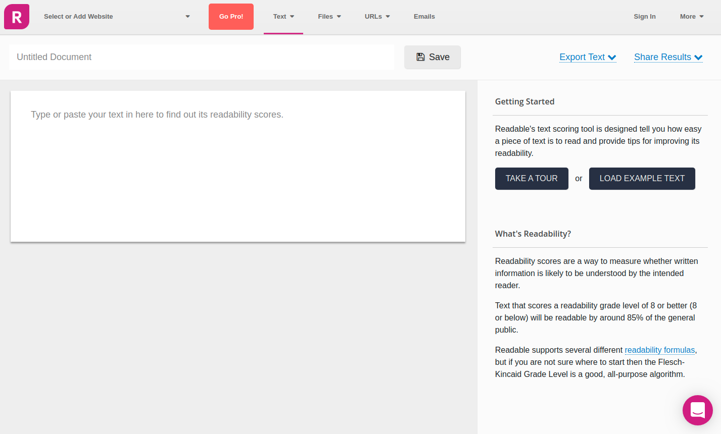
The first change you'll notice when you log in is that the app is a little less colourful. That's no accident! We use colour a lot, and we wanted to make sure that when we did, it meant something. So we've knocked back or removed colour for things that aren't intended to grab your attention so we can help you focus on the things that are!
Reach!
We have long wanted to give some clear idea of what a specific readability score means for your content. A grade level of 12 is high, but what's the real-world meaning of that readability score?
So we've spent some quality time working through literacy studies and readability research, and we have added a new visual measure item to our scores, which we're calling "Reach".
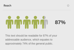
The "Reach" score is the percentage of your target audience that is likely to be able to easily read your content. We are planning to add the ability to more precisely define your target audience in a future release, but for the moment the target audience defaults to the general public.
So, a piece of text with a Reach of 100% will be readable to 100% of the literate public, or 85% of the general public.
This is very new, and we'll be improving it over the coming months, but we hope it helps to show the real-world impact of improving the readability of your content.
Document navigation
One of the features we've been developing over the last year or so is our document navigator (described by one customer, quite accurately, as "those weird dots).
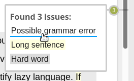
The weird dots are still there but more closely tied to the scrollbar of the content, and the feedback when you move your mouse over now includes the actual issues we found rather than just more dots.
You can still click on a dot to go to that paragraph, or on one of the issues to go straight to it.
New Scorebar
[twenty20 align="right" width="300px" img1="6022" img2="6023" direction="horizontal" offset="0.5" before="Before" after="After"]
Our scorebar has been updated and modernised, so the most important information is more quickly available and it's visually cleaner and clearer.
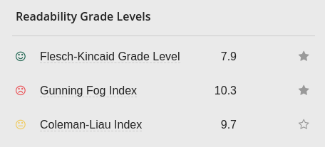
We have changed the favourites icon for each item - previously this was available from the info popup for each score or stat, but the feedback we had was that that was too hard to find. Now it is always in view alongside the item.
The previous tabs used icons, but those were pretty vague. The new tabs include key information that you told us was what you cared most about, so now even when you're switching between tabs you can still see those headline figures.
Finally, you told us that the background colouring of items to indicate whether those scores were acceptable or not was too vague and distracting. So we've replaced the coloured backgrounds with a simple red/yellow/green smiley to indicate whether something is good or not. Yellow scores are those which are within 10% of failure.
Tour
Finally, we have experimented with several different approaches to introducing users to the app, and have rolled out the latest version of our product tour. This is a pared-down version of the previous tour and hopefully gets to the point rather more quickly.
We'd love to hear your feedback about these changes and any suggestions you'd like to share for the next round of design updates!