It's the beginning of May, and that can only mean one thing - it's time for our quick recap of what we've added, removed or changed in ReadablePro over the last month.
New office
This isn't strictly a feature in ReadablePro, but it's still definitely worth talking about. Until last month, we were based just outside Brighton, in a small business park near Burgess Hill.
That suited the company well when the company was just one person, but as things have grown it's become less and less practical. We're also all huge fans of striking a good life/work balance, and that means we all regularly work remotely.
So, we've left our slightly-rural office behind and have taken some space in Platf9rm Brighton. Platf9rm offers far better flexibility for our growing team, as well as all of the advantages of being based in the city of Brighton.
It's a new chapter for us, and we're incredibly excited to be trying something a bit different. So far we're loving the variety it brings, the far more frequent interactions with other digital professionals and the unlimited coffee.
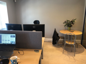
Out with the old ...
|
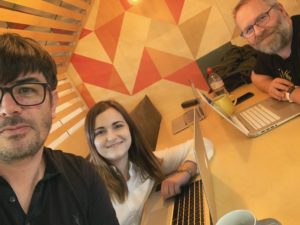
and in with the new.
|
Colorful feedback
We present a lot of data to our lovely customers, and it isn't always obvious what requires immediate attention. So, we've added target scores and colors to our feedback where appropriate.
There will be a comprehensive blog post on the specifics of this in May, but the short version is that we've spent a lot of time analyzing various books, blogs, research papers, newspapers and more to find out what successful writers are doing.
We've also spent time trawling through a century's worth of readability research. Combining those allowed us to set some really useful targets for specific scores in your content, and our new colorful interface helps you to spot which of those targets you should aim for next.
Minor interface updates
We are always looking to make our interfaces work that little bit better, and throughout this month we've been rolling out a set of updates and improvements to our interfaces, including:
- Updates to all PDFs to improve data presentation and pagination
- Mobile interface tweaks to ensure navigation works more like the familiar desktop interface
- Improved feedback in the PDF generation process
New formula introductions
We (Laura, really) have been writing up an introduction to each of the readability formulas we provide. This month we've added introductions to:
Transition words
Transition words can make your content easier to read and digest. They are good for linking connected thoughts and engaging users.
Unlike most of our text highlighting, this is a positive highlight. Use of these words is a good thing, up to a point, and we want to encourage people to use them.
As with all of our other highlighting tools, this is configurable; if you don't want to see these highlighted, you can turn this feature off in your account preferences.
Text labs
We have several tools which are fairly experimental. They are interesting, and they are useful, but they are also not quite at the stage where we feel comfortable calling them complete.
Our gender analysis tool is a great example of this - the science behind it is pretty reasonable, but the data we have available to power the tool leaves us with lower accuracy in our results than we'd like.
Moving several tools into a new Labs section makes it clearer that these tools are still in development.