Saturday 30th July is Paperback Book Day. Learn about the history of this medium.
The paperback revolution in publishing
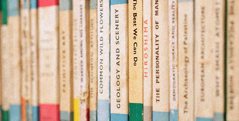
The paperback revolution was well established by the early 1950s. Paperbacks began to grow. Starting with the prewar Penguins and extending to many other companies, into well-printed, low-cost books on every possible subject. Including a large range of first-class literature. On the Continent, they were known as pocket books. They swept the world, producing new book readers on an unprecedented scale.
Their usage has been particularly prevalent in developing countries. Particularly in Africa. The new paperbacks were widely available. Not just in bookstores but also in pharmacies, street kiosks, and newsstands at train stations, hotel lobbies and airports. The low price of the paperback, which put books into the realm of impulse purchasing for the first time, is attributable mostly to the vast number printed. Seldom fewer than 30,000 and usually considerably more.
The majority of paperbacks have been reprints of successful clothbound novels. Typically, the paperback publisher makes an offer to the hardcover publisher to purchase the paperback rights. Then, the paperback profits are split between the author and the hardcover publisher. While many of the major paperback publishers have created a certain number of previously unpublished books, the paperback business is mostly based on works from traditional publishers. It is consequently a misconception to believe that, despite their seeming popularity, the paperback book will eventually supplant the hardcover book.
Penguin as a paperback icon
Penguin paperbacks were enormously important in paperback history. They are still celebrated for their sleek graphic design and eye-catching colours.
The first 10 Penguin paperback publications, including Agatha Christie's The Mysterious Affair at Styles, Ernest Hemingway's A Farewell to Arms, and Dorothy Sayers' The Unpleasantness at the Bellona Club, were extremely popular, and Penguin had sold over three million copies after just one year in business.
Penguin's visual design was crucial to the company's success. Unlike other publishers, Penguin focused on the brand rather than the title or author of the book. Simple, clear typography, and colour coding. And, of course, the familiar bird adorned the covers. The appearance aided in gaining attention. Comments about the paperbacks included, "The production is magnificent," and "perfect marvels of beauty and cheapness."
During WWII, troops carried Penguins. They were tiny enough to fit in a uniform pocket. The books were picked for the Services Central and Forces Book Clubs. The Puffin Picture Books label for children was founded in 1940. Children facing evacuation could take with them to their temporary, unpredictable homes. Penguin performed better than the competition during paper scarcity, and the volumes' basic design allowed Penguin to readily handle the typographic constraints. During the war, author and professor Richard Hoggart observed that the books "became a signal: if the back trouser pocket bulged in that way, that usually indicated a reader."
So popular were Penguin paperbacks in the second world war that they were carried in the same bag as a gas mask, according to historical reports. They were also carried in battle dress, placed in a pocket above the left knee.
Paperback Book Day
The date of Paperback Book Day commemorates when Penguin first started publishing their paperbacks in 1935. We mentioend their being popular in a war context. Penguin paperbacks also sparked a revolution because the frequency of using rail transport was increasing. This was due to their portability. The popularity of paperbacks has only grown since then.
To celebrate Paperback Book Day, here are some of our favourite Penguin paperback designs:
Nineteen Eighty-Four
:format(jpeg)/cdn.vox-cdn.com/assets/2002973/Orwell_-_1984.jpg)
One of the most cleverly designed Penguin covers is Orwell’s Nineteen Eighty-Four. That the title becomes less censored with the user’s wear and tear is appropriate for the themes of censorship. It helps solidify the novel as a dystopian classic.
A Clockwork Orange
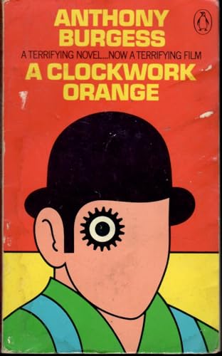
This is easily one of the most famous book covers of all time. The Penguin cover features what is commonly called the ‘cog-eyed droog’. This iteration of the cover was published after the film adaptation. Kubrick expressly forbade publishers from using elements of the film poster for the book's cover. You can see the relationship between the cog eye and the makeup used in Kubrick’s film. It takes inspiration from it indirectly and executes it differently as a thematic design element. This cover was done in a hurry but turned out to be the most iconic iteration of the book’s branding.
A Clockwork Orange… Again

Sorry for the repetition, but the most recent cover for A Clockwork Orange deserves a mention too. This is for a reason very important to us. Designed by Jonathan Barnbrook, he explained the decision behind this cover. Despite his layered style of the past, “You can be as radically different with simplicity as you can with complexity”. We are believers in simplicity at Readable. We couldn’t agree more that ideas can be presented impactfully this way.