Website accessibility is all about making websites available to everyone. As well as content readability, accessibility is boosted by usability and visual readability. We’ll cover what this means for your website and an example of usability principles in action.
What is readability in web design?
Readability covers a couple of different aspects of web accessibility. Here are some of them as a starting point:
Reading ease
First and foremost, your content must be easy to understand. Employ a ‘content first, design second’ approach. This way, you won’t fall into the trap of creating a website that is visually stunning but incomprehensible. Think of the last time you read a dense Terms and Conditions page. T&Cs can be some of the most frustrating documents to read, and they don’t need to be. By reducing jargon, shortening sentences and using plain language, you can improve your user’s perception of your website.
Reading ease is essential for readability and accessibility. Failing to match the reading level of the general public could lose you millions of leads.
Hierarchy
Your content should follow a hierarchical structure. This will improve its scannability. Visually, this means having headings and subheadings which are distinctive. Make sure your h1, h2 and h3 hierarchy makes sense in terms of the font size.
Apply a hierarchical structure to your articles, too. Summarise the content of your article in your opening paragraph and split your points into sections. Make use of subheadings to make your piece easily navigable.
Contrast
Contrast is important for accessibility purposes. It may be perceived differently by those with visual impairments or visual or cognitive disabilities. A good contrast level also makes for a good reading experience for people generally. It’s a good idea to make sure your contrast levels meet WCAG guidelines.
Generally speaking, black on white is the most readable for text.
Typography
Typography is a vital piece of the readability puzzle. A page could contain great information whilst being too hard to read. A useful site has a great user experience. Pay attention to:
- Line height - aim for a happy medium. Too short is too cramped. Too high confuses the eye and makes your content look disjointed
- Letter spacing - again, go for a medium letter spacing for body text. Having a normal distance between letters will ensure an easy reading experience
- Line length - words per line is an important factor in typography. Try not to go too narrow or too wide
Why is readability in web design important?
The aforementioned elements of website design are so important because, as well as accessibility being vital, Google prefers content that is more usable. Sundar Pichai, CEO of Google, says:
“When we say we want to build for everyone – we mean it. Accessibility is written into our mission statement and core to our values as a company. We don’t think a problem is solved until we’ve solved it for everyone. Technology’s great promise is to give everyone the same power to achieve their goals. As long as there are barriers for some, there’s still work to be done.”
If you do the right thing by your reader, you will in turn do right by your website. It’s beautifully circular. You will be rewarded for your efforts by improvements in your rankings.
What are some good examples of accessibility in design?
The UK Government design team’s online portfolio is a goldmine of design accessibility principles.
Take this poster as an example:
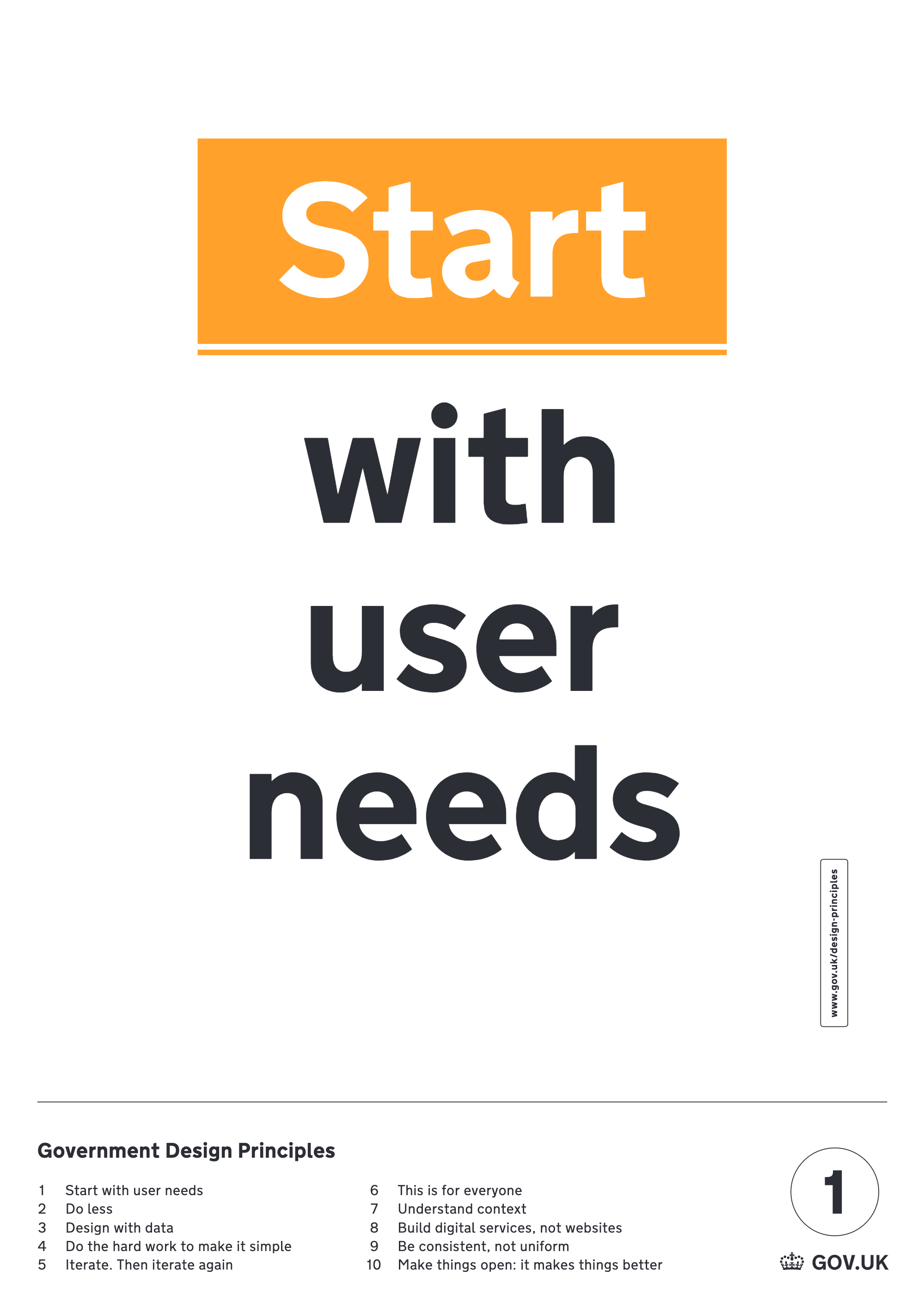
(Source)
Here, they present the core principle of accessibility - start with your user. The experience starts and ends with your user, so meeting their needs is essential. Get into the habit of considering your user before every website decision you make, big or small.
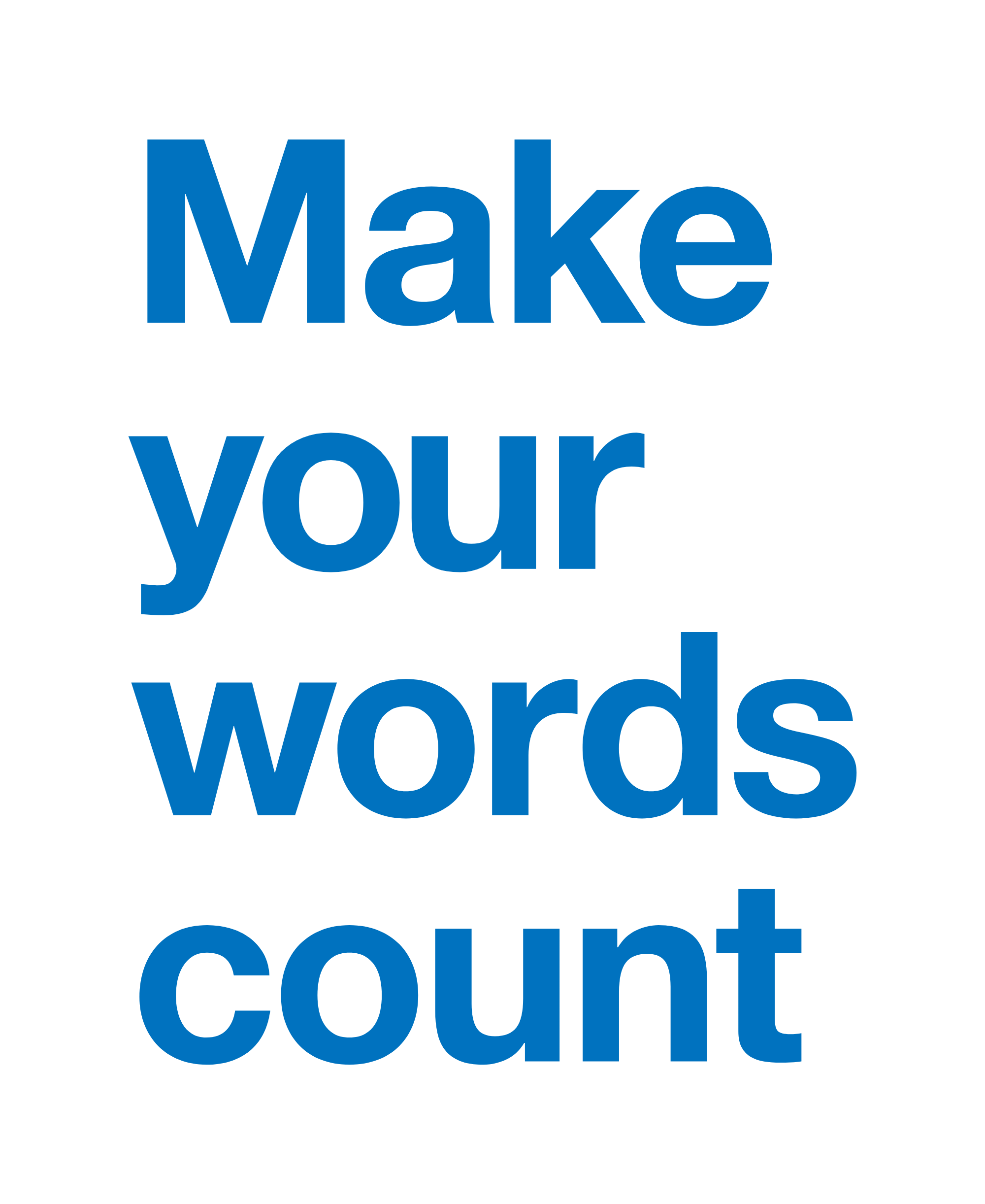
(Source)
The above image is also a good example of practicing what they preach. They convey their message with a short, punchy phrase. You can apply this principle to your web design by reducing wordiness in your content.