Readable has a focus on the plain language side of readability. We can help you to change your language and content structure for better readability. We also follow developments in readable design. And this study caught our eye.
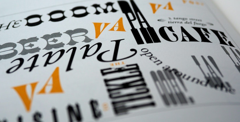
What font is easiest to read?
Before covering the study, it’s important to give some background. What is the general consensus - or lack of? It’s often taken for granted that sans-serif fonts are considered the easiest to read. They are more minimalistic and screen-friendly.
However, the topic is hotly debated. The “sans-serif is easiest” assumption isn’t always true.
Instead, these are some of the things taken into consideration:
- Legibility and availability. It isn’t enough for the font to be the most legible on webpages. They have to also be available to most audiences.
- Are there similarly shaped letters and numbers? This can be confusing for readers and slow their reading down.
- How short are the ascenders and descenders? Short ascenders and descenders, when combined with shape similarity, can cause problems for those with dyslexia.
With that being said, usability studies show that there are some favoured fonts. Times New Roman is familiar to many as a default font. It passes key legibility factors such as its x-height. This shows that serif fonts can be readable.
In terms of sans-serifs, Helvetica is a fantastic option for graphic designers. Its tall x-height makes it easier to read at a distance. The best font for readability, depends on the context. Arial would be a better option for general web writing. This is because it’s more available to Windows users and Mac users alike.
Despite all this, there is no “one size fits all” solution. The following study reinforces that.
Personalised fonts speed up reading
A fascinating recent study has shown that not only do fonts tailored to the user speed up reading, they improve comprehension. We’re all about improving comprehension at Readable. It’s not enough for a sentence to be legible. The audience needs to take it in and truly understand it to receive your message.
Researchers at the University of Central Florida have discovered that there is no one-size-fits-all method for digital reading. Changing the font style and size can speed up reading while preserving understanding. Like corrective eyewear for the digital age.
The Readability Consortium at UCF conducted the study. It found that switching to a more appropriate typeface for the reader resulted in a 35% boost in reading speed. All the while retaining understanding. Reading rates and degrees of comprehension were compared according to the fonts in the study.
This study has huge implications. That tweaks to content and design can open up a whole new world of reading for a wide audience. Personalising your reading for the audience’s reading preferences and level ensures they are included.
Readability for all means businesses get more done. That patients are more involved in their healthcare. That students enjoy reading more and learn faster.
Co-author of the study, Ben Sawyer, said the following:
"These results emphasise that personalization is key. It encourages future work in creating tools and conducting research that help readers discover the format that optimises their personal reading experiences."
Curious to see for yourself? You can even take the test. It may surprise you. You aren’t always aware of what font is easiest for you to read.
What does this mean for readability?
Further research is needed. Regardless, this study is an encouraging exploration of tailored font preferences. It has big implications for the future of font design. Individuated typography could revolutionise the way people read. It could also open up reading for enjoyment. There is a huge audience of people who struggle to concentrate on it.
If you’re interested in readability in design, you may enjoy our blog post about usability.